Supply Chain Health Dashboard: OTIF and Fill Rate Performance Monitoring
Supply Chain & Logistics
Supply Chain Health Dashboard: OTIF and Fill Rate Performance Monitoring
Which supplier is quietly dragging your OTIF below ninety percent?
Problem Statement
The Scenario
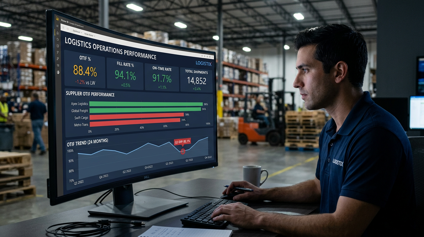
PeakFlow Distribution is a mid-sized consumer goods distributor operating across five regional zones in North America. The company manages relationships with over sixty suppliers spanning electronics, apparel, home goods, food and beverage, industrial parts, and health and beauty categories. In fiscal year 2024, leadership identified a troubling pattern: customer-facing service levels had slipped, with several key retail clients raising complaints about incomplete deliveries and late arrivals. The VP of Supply Chain Operations estimates the business processed roughly twenty-five thousand shipment order lines across the two-year operating window, yet has no single place to see how suppliers are actually performing against their delivery commitments. Decisions about contract renewals, supplier tiering, and safety stock adjustments are currently being made on gut feel and disconnected spreadsheets. That needs to change before the next supplier review cycle in Q2.
The Data Challenge
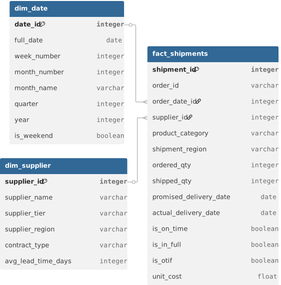
You have been handed three data files extracted from PeakFlow's ERP system. The first is a fact table containing one row per shipment order line with quantities ordered, quantities actually shipped, promised delivery dates, and actual delivery dates. The second is a supplier dimension table describing each supplier's tier classification, operating region, contract type, and average lead time. The third is a standard date dimension table covering the full two-year window from January 2023 through December 2024. Your job is to connect these three tables into a proper star schema data model, define the calculated KPI fields for OTIF and Fill Rate, and build a dashboard that makes supplier health instantly readable. The modeling challenge lies in correctly joining the fact table to the date dimension using the right date field — there are two date columns in the fact table and choosing the wrong one will break your time intelligence entirely. You will also need to decide how to define OTIF as a calculated field rather than relying on the pre-flagged column, so you understand the business logic underneath the metric.
What's at Stake
This dashboard will be reviewed weekly by the VP of Supply Chain and monthly in the executive supplier review meeting attended by the CFO and Head of Procurement. Three concrete decisions depend on it: which Tier 2 and Tier 3 suppliers should be placed on a performance improvement plan, which product categories are most exposed to fill rate risk heading into peak season, and whether the regional distribution of shipment volume aligns with delivery performance. Every chart on this dashboard maps directly to a contract or inventory decision. A supplier consistently below eighty-five percent OTIF faces renegotiation. A product category with fill rate below ninety percent triggers a safety stock review. The dashboard is not a reporting exercise — it is a decision-support tool with a real business calendar behind it.
Data Schema
Datasets(3)
dim_date.csv
30.2 KB
dim_supplier.csv
3.5 KB
fact_shipments.csv
2.2 MB