KPI Dashboard: Retail Store Sales, Traffic and Conversion Performance
Retail
KPI Dashboard: Retail Store Sales, Traffic and Conversion Performance
Which stores are pulling foot traffic but quietly losing the sale?
Problem Statement
The Scenario
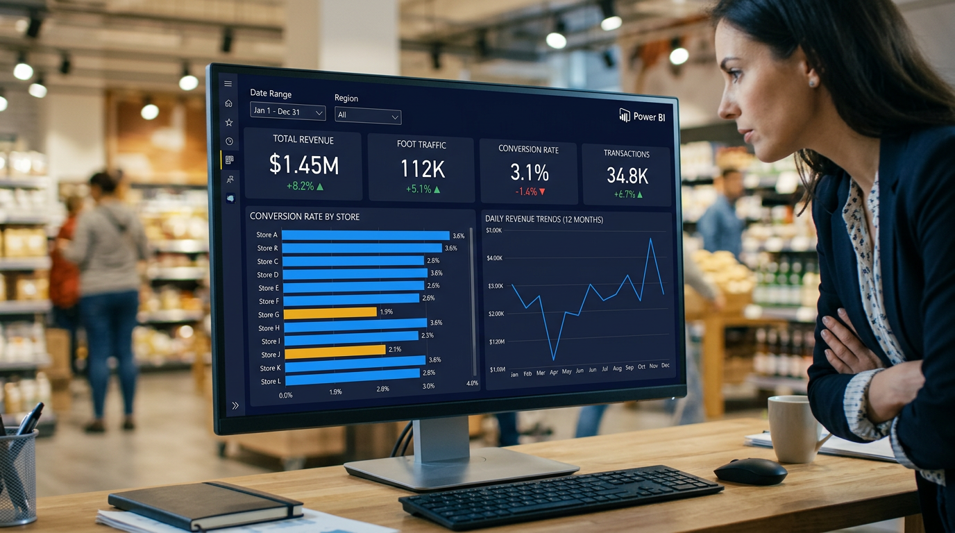
BrightMart is a mid-sized specialty retail chain operating twenty stores across four regions in the United States — Northeast, Southeast, Midwest, and West. After a year of heavy investment in foot traffic campaigns — including in-store events, loyalty promotions, and paid social advertising — the VP of Retail Operations has noticed something troubling in the quarterly summaries: total visitor counts are up twelve percent year-over-year, but revenue growth has stalled at just three percent. Leadership suspects that traffic is landing but not converting, and that the problem is concentrated in specific stores or formats rather than spread evenly across the chain. The executive team needs a single dashboard that cuts through the noise and answers one core question: are we converting the customers we are attracting?
The Data Challenge
You have been given three tables covering the full calendar year 2023. The first is a daily fact table recording foot traffic, transactions, revenue, units sold, and returns at the store level — one row per store per day, giving you approximately seventy-three hundred rows of operational data. The second is a store dimension table describing each of the twenty locations — their region, store format (flagship, standard, or express), city, state, square footage, and opening date. The third is a date dimension table covering every day of 2023 with week number, month, quarter, year, and a weekend flag. Your task is to connect these three tables in the correct star schema, define conversion rate as a calculated field, and build a dashboard that surfaces which stores and which time periods are underperforming on conversion — even when raw traffic numbers look healthy.
What's at Stake
The dashboard will be used weekly by the VP of Retail Operations and monthly by regional managers. It needs to answer three concrete business questions: which stores convert below the chain average and by how much; whether weekends drive better conversion than weekdays given the promotional spend concentrated on those days; and how individual stores are trending month-over-month so underperformers can be flagged before the quarter closes. Every KPI on this dashboard connects to a real operational lever — conversion rate drives staffing decisions, revenue per visitor drives marketing spend allocation, and return rate flags potential product or service quality problems at specific locations. Getting this dashboard right means the difference between redeploying resources toward stores that can be rescued and continuing to pour budget into traffic campaigns that produce no additional revenue.
Data Schema
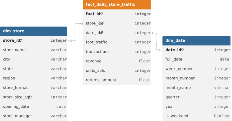
Datasets(3)
dim_date.csv
16.1 KB
dim_store.csv
1.9 KB
fact_daily_store_traffic.csv
300.5 KB