
The business cost of confusing the two — and the minimum causal toolkit every applied data scientist needs before touching observational data.
Here is a story that plays out in analytics teams somewhere every few months. A data scientist finds a strong correlation between two variables in a business dataset. The correlation is clean, statistically significant, and directionally intuitive. A recommendation gets written. An intervention gets launched. Money gets spent. And then, six months later, the intervention produces none of the expected results — because the correlation was real, but the causal relationship driving it wasn't what anyone thought.
At best, this costs credibility. At worst, it costs a budget, a project, and sometimes a job.
Correlation is easy to find. Any sufficiently large dataset contains hundreds of statistically significant correlations that mean nothing actionable. Causation is hard to establish — but it's the only thing that tells you what will happen when you change something. And in business, everything is about changing something. The gap between correlation and causation is not a statistical technicality. It is the gap between analysis that informs decisions and analysis that wastes resources.
The Mechanism That Breaks Correlation-Based Decisions
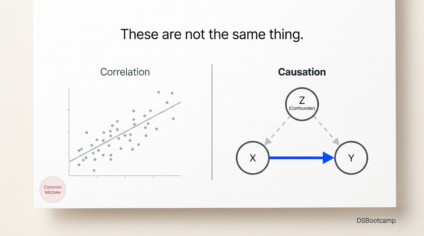
The specific mechanism that turns a valid correlation into a wrong recommendation has a name: confounding. A confounder is a third variable that causes both the variable you're measuring and the outcome you're trying to explain — creating the appearance of a relationship between them that doesn't reflect direct causation.
The canonical example in business: ice cream sales and drowning rates are positively correlated. Both are caused by a third variable — hot weather — that drives people to buy ice cream and to swim. Banning ice cream would not reduce drownings. The correlation is real; the implied intervention is nonsense.
In practice, confounders are subtler and much more dangerous. A retailer observes that stores with higher promotional frequency have higher revenue. They increase promotions across all stores. Revenue doesn't move. Why? Because stores in higher-traffic, higher-income trade areas were both more likely to run promotions (more resources) and naturally generated higher revenue (better location). Promotion frequency and revenue share a confounder — trade area quality — that makes them correlated without one causing the other in the way the analysis implied.
A marketing team finds that customers who open email campaigns have 40% higher lifetime value than customers who don't. They double email frequency to capture more of that value. Engagement rates collapse and unsubscribes spike. Why? Because customers with high purchase intent were already opening emails and buying more — email opening was a symptom of engagement, not a driver of it.
Both stories follow the same structure: a real correlation, a plausible mechanism, a confident recommendation, and a costly miss. The error is not stupidity. It's the absence of a causal framework.
The Minimum Causal Toolkit
The good news is that you don't need a PhD in econometrics to think causally about observational data. You need four things: a confounder checklist, a mental model of selection bias, and familiarity with three quasi-experimental methods that are now standard practice in applied data science.
1. The Confounder Checklist
Before drawing any causal inference from a correlation, ask three questions. First: is there a plausible third variable that affects both X and Y? Second: is the group receiving the treatment (the thing you're studying) systematically different from the group not receiving it in ways that also affect the outcome? Third: could the outcome itself be causing the predictor — reverse causality — rather than the other way around?
If you can't confidently answer "no" to all three, you do not have a causal finding. You have a correlation that requires further investigation before it justifies any recommendation.
2. Selection Bias — The Specific Confounder That Kills Business Analysis
Selection bias deserves its own mention because it is the most common confounding structure in business data. It arises whenever the people or units who received a treatment are systematically different from those who didn't — and those differences also affect the outcome.
The email example above is pure selection bias. The customers who opened emails were already high-intent buyers. They selected into email engagement based on a characteristic — purchase propensity — that independently drives lifetime value. Attributing that value to the email is selection bias.
Any time you're comparing a group that used a feature, received a communication, entered a program, or took any action with a group that didn't, you should assume selection bias exists until you have a specific reason to believe otherwise. The groups are almost never equivalent in ways that don't matter.
3. Difference-in-Differences (DiD)
DiD is the most practical causal method for business settings where a policy or intervention was applied to some units but not others, and you have pre-and post-period data for both groups.
The intuition: rather than comparing treated and control groups directly (which suffers from selection bias), compare the change in the treated group to the change in the control group over the same period. If treated stores increased revenue by 12% after a new merchandising program while control stores increased revenue by 7% over the same period, the DiD estimate of the program's effect is 5 percentage points — controlling for whatever trend affected both groups equally.
DiD Estimate = (Treated_Post - Treated_Pre) - (Control_Post - Control_Pre)
The critical assumption is parallel trends: in the absence of the treatment, both groups would have followed similar trajectories. This assumption cannot be proven — only made plausible through pre-period trend analysis. Always plot pre-period trends for both groups before running a DiD analysis. If the trends were diverging before the treatment, your DiD estimate is biased.
4. Regression Discontinuity (RD)
RD exploits a rule-based threshold to create a natural experiment. The logic: if customers above a certain spending threshold receive a loyalty tier upgrade and customers just below it don't, the customers on either side of the threshold are essentially identical in all relevant ways — they just happened to land on different sides of an arbitrary cutoff. Comparing outcomes just above and just below the threshold gives a clean causal estimate of the upgrade's effect.
This is applicable in far more business contexts than people realize: credit score cutoffs, age-based eligibility rules, geographic boundaries, score-based intervention triggers in ML systems. Any time there's a threshold rule in your business, there's a potential regression discontinuity design.
5. Instrumental Variables (IV)
IV is the most powerful and most demanding method in this toolkit. An instrument is a variable that affects the treatment but affects the outcome only through the treatment — no direct effect on the outcome, no correlation with confounders.
The classic business application: using a randomly assigned discount coupon as an instrument for purchase behavior. The coupon affects whether someone buys (the treatment) but affects revenue only through that purchase decision — not independently. This breaks the selection bias because coupon assignment was random, not driven by purchase propensity.
Finding valid instruments in practice is hard. The exclusion restriction — the requirement that the instrument affects the outcome only through the treatment — cannot be tested statistically. It must be argued on logical grounds. This is why IV estimates are powerful when they work and fragile when the instrument is weak or the exclusion restriction is violated. Use IV carefully, justify the instrument explicitly, and always check the first-stage F-statistic to confirm the instrument is genuinely predictive of the treatment.
from linearmodels.iv import IV2SLS

# Z = instrument (e.g., coupon assigned)
# D = treatment (e.g., purchased)
# Y = outcome (e.g., 90-day revenue)
# X = controls

model_iv = IV2SLS(dependent=Y,
                  exog=X,
                  endog=D,
                  instruments=Z).fit()
print(model_iv.summary)
The Honest Framing for Stakeholders
One of the most valuable professional habits a data scientist can build is the discipline of being explicit about what type of claim their analysis supports. There are only two honest options:
Descriptive / Associative: "Customers who do X are Y% more likely to Z. We don't know whether doing X causes Z, but the association is strong and consistent."
Causal: "We estimated the effect of doing X on Z using [method], controlling for [confounders], and the evidence supports a causal relationship with an estimated effect size of Y."
The first framing is appropriate for exploratory work, segmentation, and hypothesis generation. The second is required before recommending any intervention. Most business recommendations are presented as causal when they're actually associative — and that gap is where expensive mistakes live.
Knowing which claim you're making, and being honest about it, is not a sign of analytical weakness. It's the mark of a data scientist whose recommendations can be trusted.
Why This Gets You Promoted
The analysts who move fastest in their careers are not the ones who produce the most analysis. They're the ones whose analysis generates reliable predictions about what will happen when something changes.
That requires causation, not correlation. It requires knowing when you have a causal claim and when you don't. It requires the intellectual honesty to say "this is associative — we need an experiment or a quasi-experimental design before we can act on it" when that's the truth.
Correlation is available in every dataset to anyone with a laptop. Causation requires judgment, methodology, and the willingness to do harder analytical work than a pivot table demands. That gap is exactly where analytical value concentrates — and where careers are built.
This post is part of DSBootcamp's Econometrics series, where we cover the causal inference methods and statistical frameworks that separate credible business analysis from expensive guesswork.